Read now
Read now

Discover Cases
Discover
Management Summary
Neo-Brutalism relies on radical clarity and visible structures
When used correctly, Neo-Brutalism creates strong brand identity, attention, and a clear stance
According to amce studios, the style combines childlike playfulness with nostalgic flair, with typography serving as a central design element that conveys the visual message
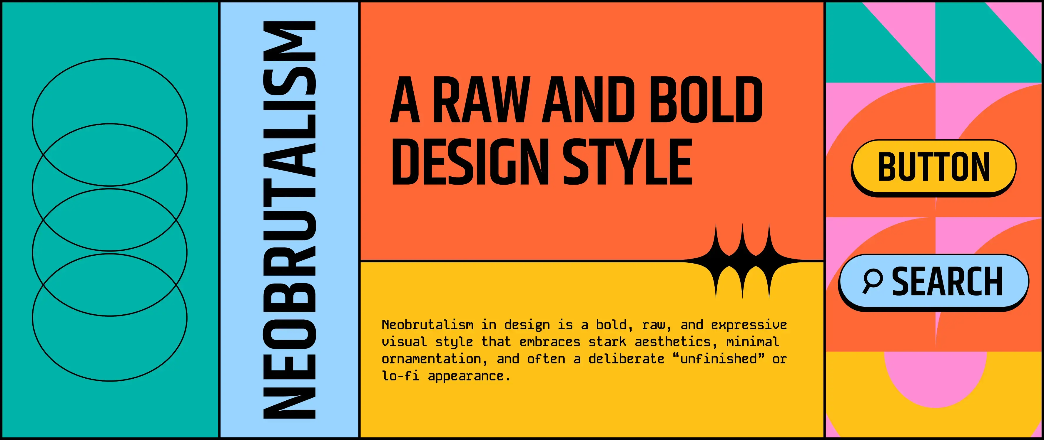
Clean, polished, perfect? Not always. In web design, a trend has emerged that deliberately thinks differently: Neo-Brutalism. What was once considered clunky or unfinished is now celebrated as a bold stylistic break—raw, direct, and uncompromising. For companies, this style offers a clear stance in an overly polished online world.
What is Neo-Brutalism?
The term “Neo-Brutalism” comes from the architectural Brutalism of the 1950s–70s, known for raw materials, sharp edges, and visible structures. In a digital context, it means deliberately foregoing polished aesthetics in favor of functionality, directness, and design honesty. Neo-Brutalist design uses elements such as strong contrasts, rough typography, simple layout grids, and clear shapes. It is loud, raw, sometimes uncomfortable—but precisely because of this, visually striking and differentiating.
Application in web design:
In web design, Neo-Brutalism represents a conscious break from the classic “user-first” aesthetics familiar in UX-optimized design. Instead of soft transitions, rounded corners, or subtle gradients, the style emphasizes radical reduction and visual immediacy. The design often appears raw, almost unfinished, and that is its strength. Colors appear in bold contrasts, buttons and areas are clearly defined, and playful design elements are consistently avoided. The focus is not on packaging but on content. Everything is visible, tangible, functional—often at first glance. This makes Neo-Brutalism a powerful tool for differentiation in a digitally over-stylized world.
Assessment by amce studios:
“This style evokes a mix of childlike playfulness and nostalgic flair. This is particularly evident in the treatment of typography: in neo-brutalist design, type does more than convey information—it assumes a central design function. While typography has always been important in branding, here it is emphasized even more,” says Chiara Mazzarella, Junior Art Director, amce studios GmbH.
Typical applications of this style include portfolio websites that want to highlight individuality with bold design. Cultural institutions that aim to break from visual conventions also use Neo-Brutalism to capture attention and convey a clear stance. Additionally, startups with unconventional brand identities deliberately adopt this
style to distinguish themselves from established players and demonstrate innovation.
Important: Neo-Brutalism is not merely a stylistic gimmick. It only works if the design approach aligns with the brand identity; otherwise, it quickly comes across as a forced effect without substance.
Share this article.


amce studios GmbH is an owner-managed digital agency based in Darmstadt. Since its founding, its customers have included large and medium-sized companies, aspiring start-ups and ambitious new founders from the technology, energy, environment, retail and fashion industries. As a full-service agency, customers are supported regionally, nationwide and worldwide in all areas related to web experience, branding, social media and 3D design. amce studios GmbH is part of the amce Studios Group.
Latest news & insights
by amce studios.
Contact
Start your project with amce studios now and we look forward to receiving your inquiry.

As digital natives, we are experiencing trends. As academics and industry experts, we know the tried and tested. This unique combination turns small moments into great experiences. Our solutions are therefore up to date and yet timeless.